
The Philippine Amusement and Gaming Corporation (PAGCOR) finds itself engulfed in controversy following the launch of its new logo, which coincided with the agency’s 40th anniversary celebration.
The revamped design aimed to symbolize PAGCOR’s role as the country’s gaming regulator, but instead, it sparked a firestorm of mixed reactions and heated debates.
PAGCOR Chairman and CEO Alejandro Tengco proudly unveiled the logo, explaining its significance. He stated, “The new PAGCOR logo incorporates the element of fire associated with energy, inspiration, passion, and transformation.
It symbolizes the flame that ignites change and drives progress.” Tengco’s words were meant to convey the agency’s commitment to guiding the nation towards development and serving as a beacon of inspiration.
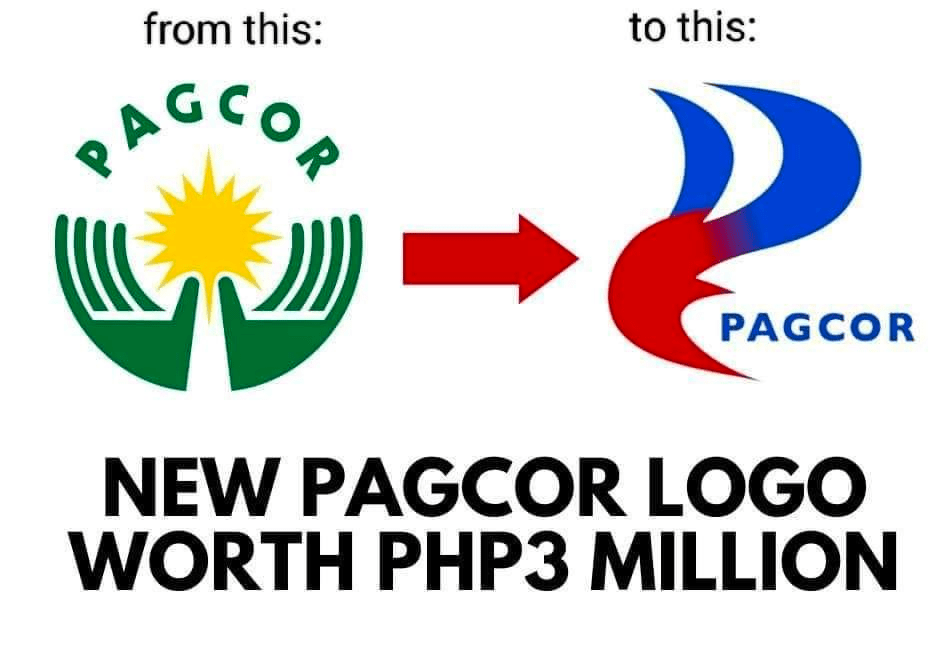
However, the public’s response to the logo was far from unanimous. Social media exploded with commentary, with netizens questioning whether the new logo was worth its hefty price tag. Twitter users, in their usual blunt style, voiced their skepticism. One user, Twittezen Carwyn Candila, tweeted, “New BSP logo costed ₱52.5 MILLION. New PAGCOR logo costed ₱3 MILLION. These new logos failing in design may be a divisive opinion, but one thing’s sure: these must be investigated for graft and corruption.”
Amidst the outcry, Oppa Philippines (@oppaphilippines) chimed in, comparing the PAGCOR logo to a popular cooking gas brand, adding a touch of humor to the conversation. JNZ (@JnzTweets) couldn’t help but draw parallels between the PAGCOR logo controversy and the ongoing uproar surrounding the “Love the Philippines” tourism campaign. It seemed that public sentiment was already strained due to recent tourism mishaps, making PAGCOR’s logo debacle all the more significant.
While the criticism focused on the design and cost of the logo, others questioned the procurement process itself. Graphic designers and netizens expressed their disappointment, suggesting that PAGCOR could have organized a logo-making contest, allowing Filipino talent to shine and potentially resulting in a more fitting and cost-effective design. The selection of Francisco “Dopy” Doplon of Printplus Graphics Services raised eyebrows, as some wondered if there were better alternatives that were overlooked.
In the midst of the controversy, netizens injected humor into the situation. Wonder Boy (@w0nderboi) playfully quipped, “Many do not understand how the PAGCOR logo was created. Fibonacci sequence was used to ensure the logo is in tune with the Earth’s resonance, hence the 3M price tag.” Although clearly a joke, the comment highlighted the general sentiment surrounding the logo’s cost and the need for transparency in government expenditures.
As the Bongbong Marcos administration faces the fallout from a tourism fiasco involving an embarrassing slogan and AVP, the PAGCOR logo controversy adds further strain to the country’s tourism reputation. The incident serves as a reminder of the importance of responsible decision-making and transparency in government agencies, especially when significant funds are involved. The public eagerly awaits a resolution to the logo debacle, hoping it will serve as a wake-up call for more prudent decision-making in the future.
